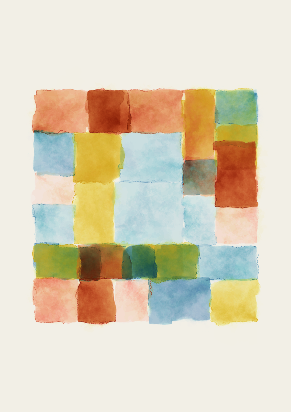
An Arrangement Between Colours
An Arrangement Between Colours (AABC) is a generative art colour study. It was created using javascript to draw parametric geometry to the HTML canvas. The system was designed as a way explore the effects of colour and proportion within an irregular grid by partitioning the canvas with a series of structured rules and rhythms. Each cell is then 'painted' in a predefined colour palette of varying patterns to explore interactions.
Aesthetically inspired by the abstract landscape works of Paul Klee, the project marries theories of programmes design, drawing primarily from Karl Gerstner's essay Programme as Picture (1963).
Consider the following excerpt from Gerstner:
I proceed from this assumption: there is no hierarchy of values either of proportion or of colour. Both are media equal in value.
The question of harmony or dissonance is one of structure, or in other words, one of the combination of proportion, proportion and colour, colour and colour.
…The only constant of the picture is its idea; the proportions can be changed, the colours can be interchanged within their system; the measurements are fortuitous.
In line with Gerstner's principle that there is no hierarchy between colour and proportion, AABC treats each element as equally significant. The systems rules attempt to ensure both variation and harmony.
The outputs carefully chosen to define the system showcase both unlikely, yet aesthetically pleasing arrangements from the possibility space.
While the programme might be inherently neutral, the play between random and structure can yield unexpectedly beautiful results, raising questions about the nature of aesthetic pleasure and the role of the artist in curating the process.
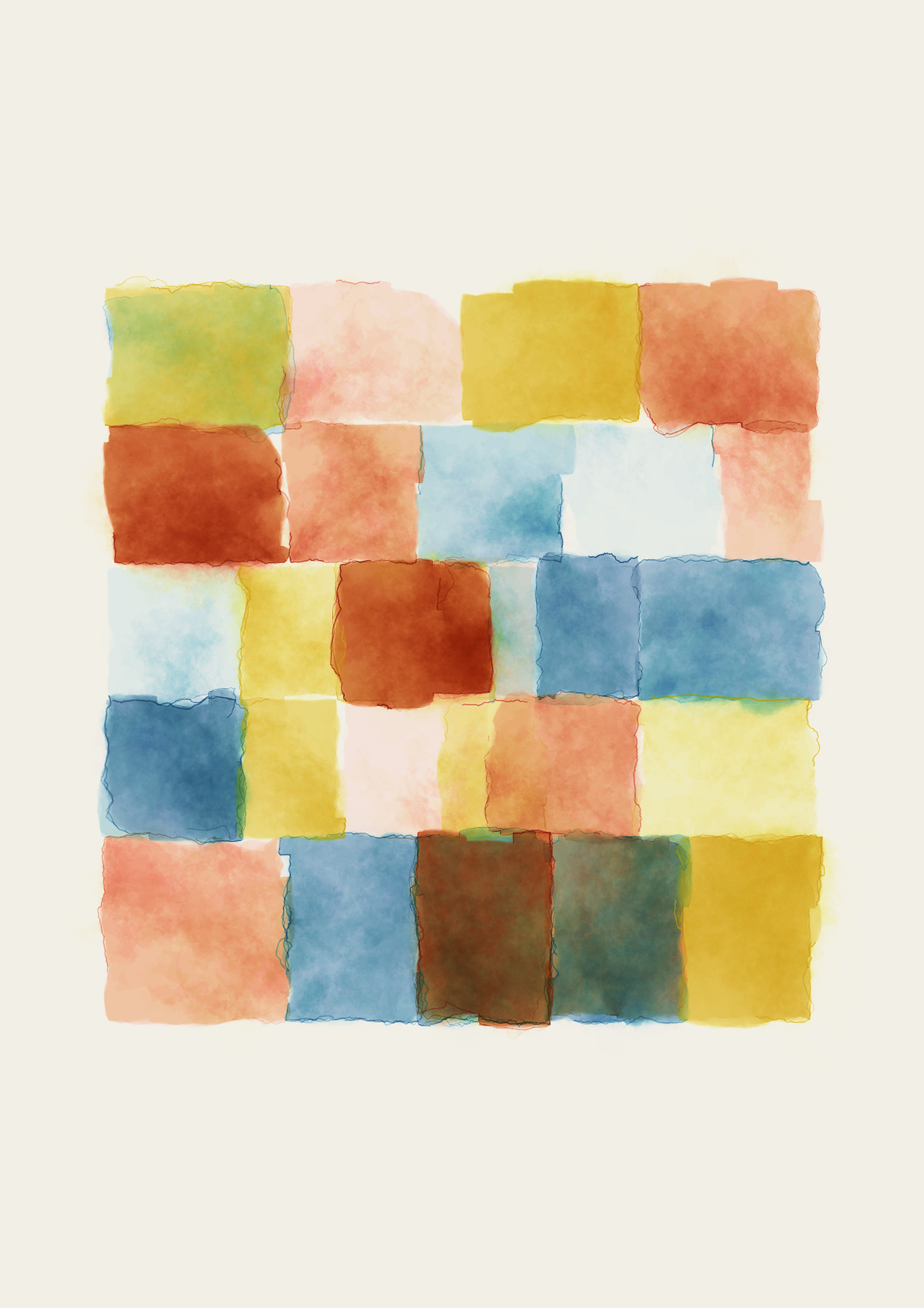

Click for larger image
A Short Word on Gerstner
Karl Gerstner (b. 1930 - 2017, 86) was a Swiss born designer, typographer and artist. His most well known work Designing Programmes consists of four essays detailing systematic approaches to design problems and suggests models for design in the emergent era of computers.
Gerstner's methods, even though conceived in the early days of computational design, remain remarkably relevant in today's digital age. As designers and artists increasingly turn to algorithms and data-driven processes, his vision of systematic creativity offers invaluable knowledge on how we might use technology to expand artistic expression.
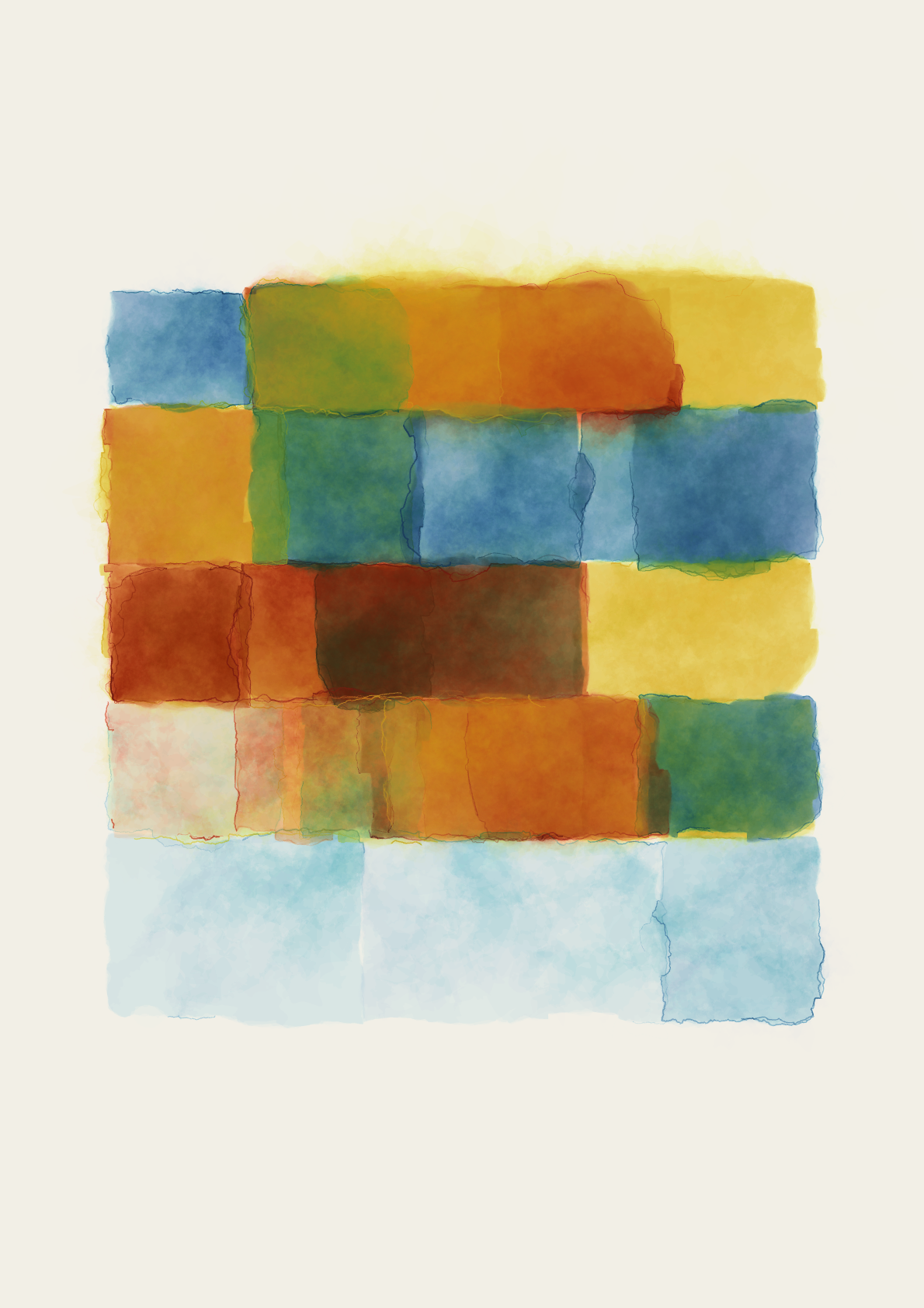
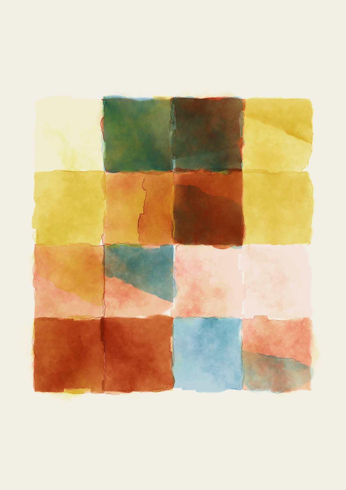
Click for larger image
A Hardcopy
The following details are subject to change.
Each of the outputs includes a giclèe hardcopy counterpart, printed on Henumule archival paper so collectors can live with the art.
Additional details:
- Gilcée print on 310gsm archival paper
- Signed
- A3 size. Never rolled or folded on delivery
- Custom System/Arrangement Documentation
More information to follow.

A page from Designing Programmes
The Arrangement - Documentation
Three rules govern the primary makeup of The Arrangement. They consist of the grid composition, palette (including colour frequency) and colour density. Let's take a closer look at each of these.
Firstly, to form the grid an area of the canvas is recursively divided using four different rhythms:
- Halves (fig 1.a)
- Thirds (fig 1.b)
- Quarters (fig 1.c)
- Irregular (fig 1.d)
Occasionally, rather than split an area into two child areas, the parent area is kept along with one of the children. This behaviour is attributed as an overlap and it's frequency is described as low, medium, or high.
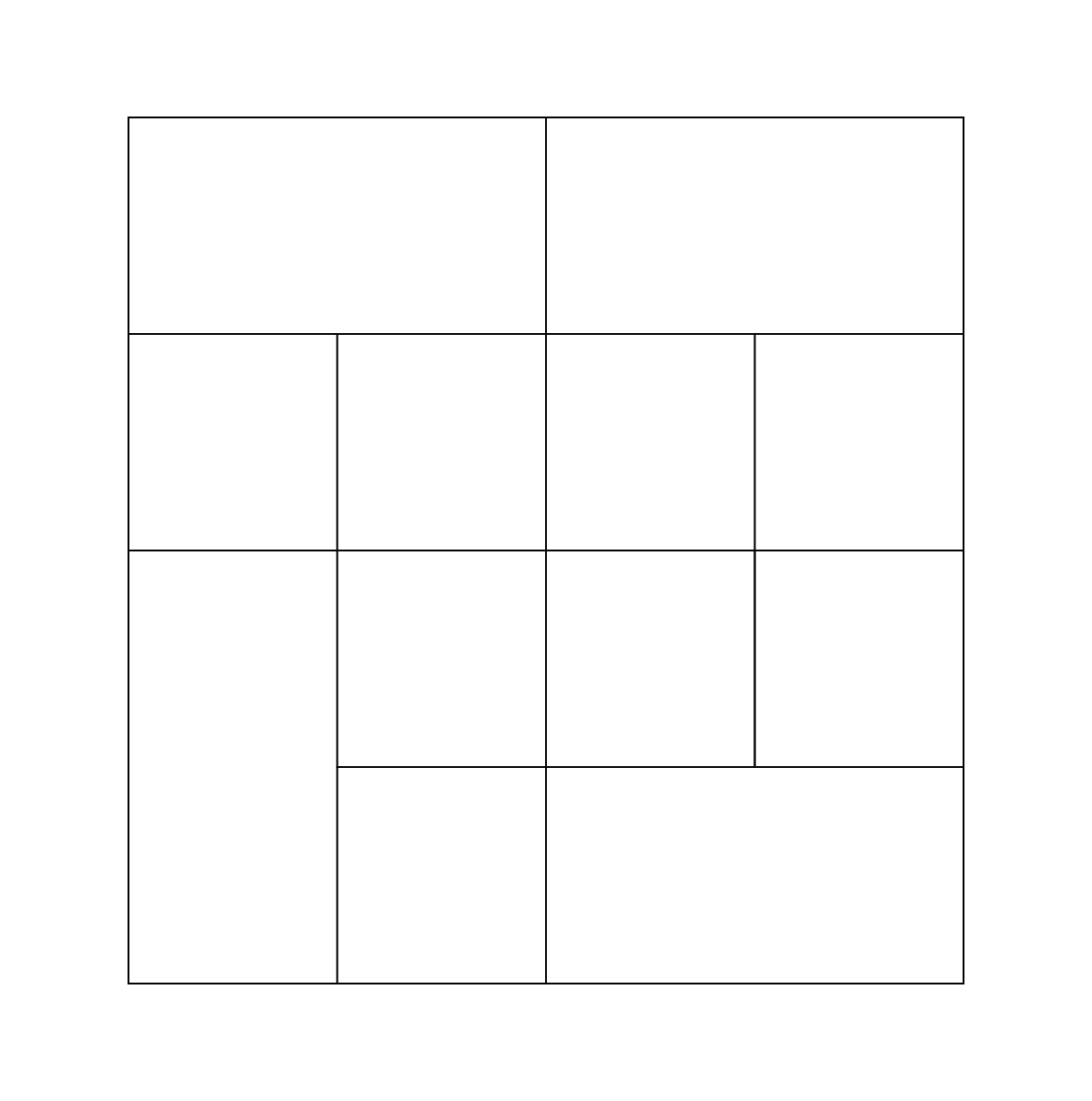
1.a - Halves
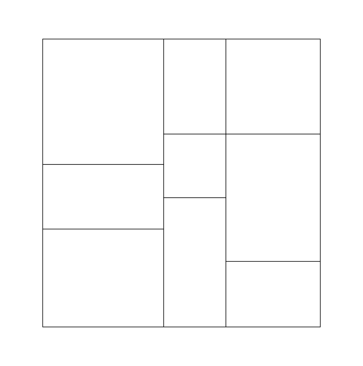
1.b - Thirds
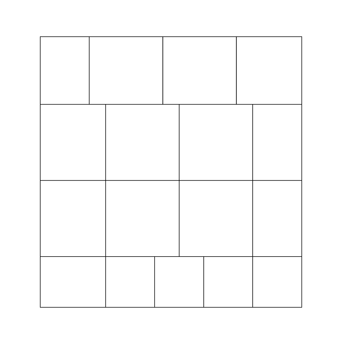
1.c - Quarters
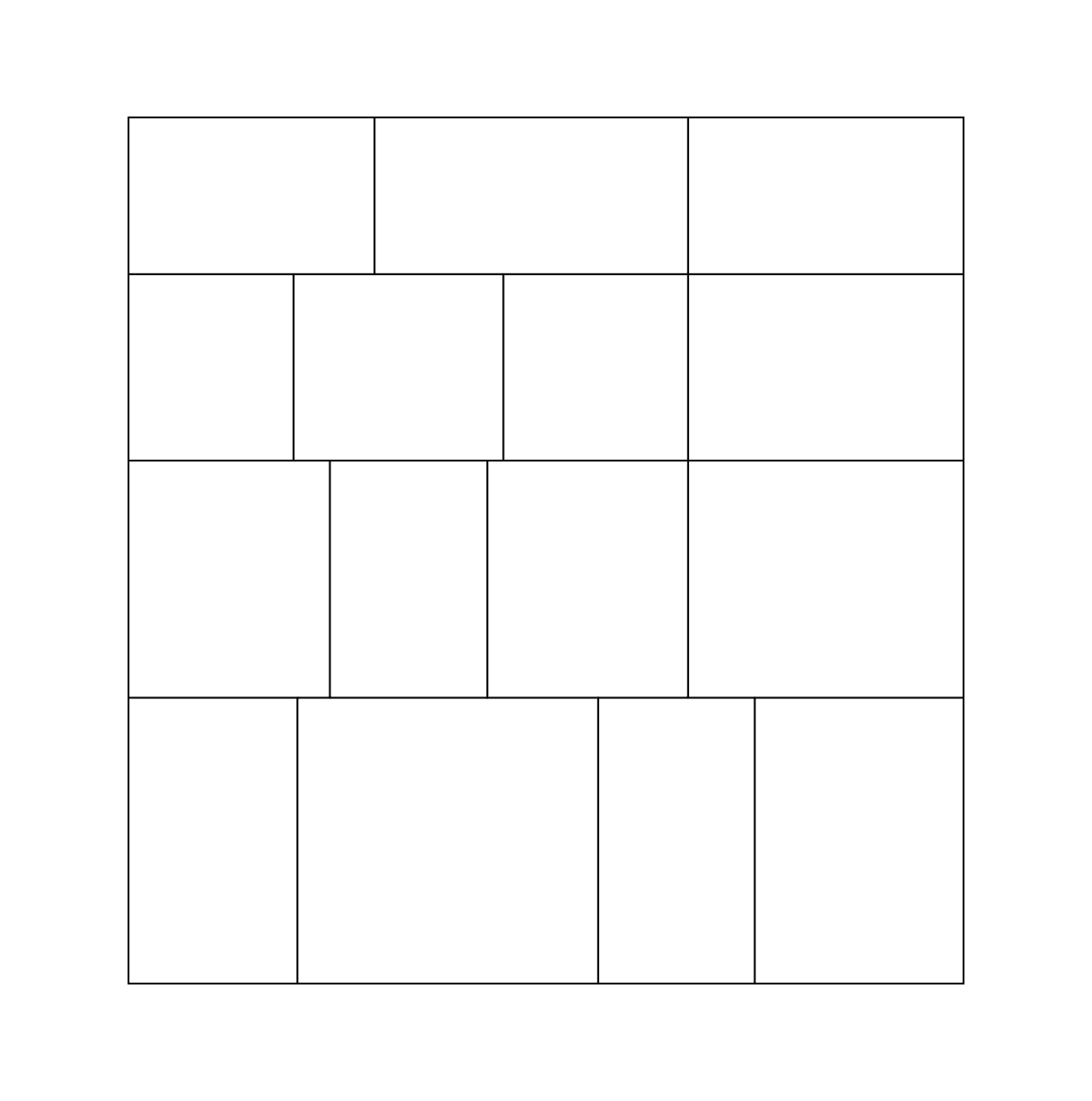
1.d - Irregular
Once we have our grid composed, we may apply colour. In order to do this we first arrange our grid in either lexicographical order (including reverse lexicographical) or by distance from a random origin point. This leaves us with a linear interpretation of a grid (fig 1.e).

1.e
From here we may assign colours to our linear grid in three different ways:
- Percentage based. Attributed as Regional (fig 1.f)
- Round robin. Attributed as Rhythm (fig 1.g)
- Randomly. Attributed as Chance (fig 1.h)

1.f - Regional

1.g - Rhythm

1.h Chance
Finally, we consider the density of each colour. Density refers to how intense the colour is painted on the canvas. Each individual colour has an independent lower and upper boundary for this. So, similar to how we represented our grid to assign colour, we can do the same for density. Represented as:
- Percentage based. Ranges in low, mid and high. Attributed as Regional (fig 1.i)
- Round robin. Attributed as Rhythm (fig 1.j)
- Randomly. Documented as Chance (fig 1.k)

1.i - Regional

1.j - Rhythm

1.k - Chance
Bringing these rules together creates The Arrangement system, which via combinatorics, should provide a wide and varied range of compositions.
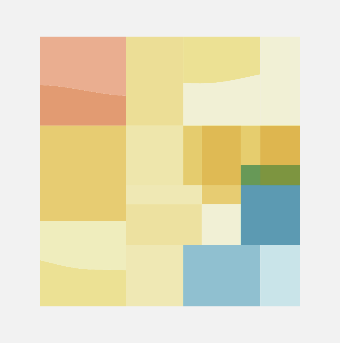
col: Regional | den: Rhythm | gri: Thirds

col: Regional | den: Rhythm | gri: Quarters

col: Regional | den: Chance | gri: Halves

col: Chance | den: Regional | gri: Irregular
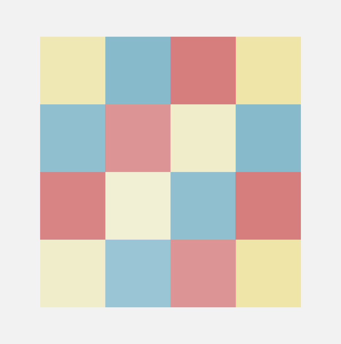
col: Rhythm | den: Rhythm | gri: Halves
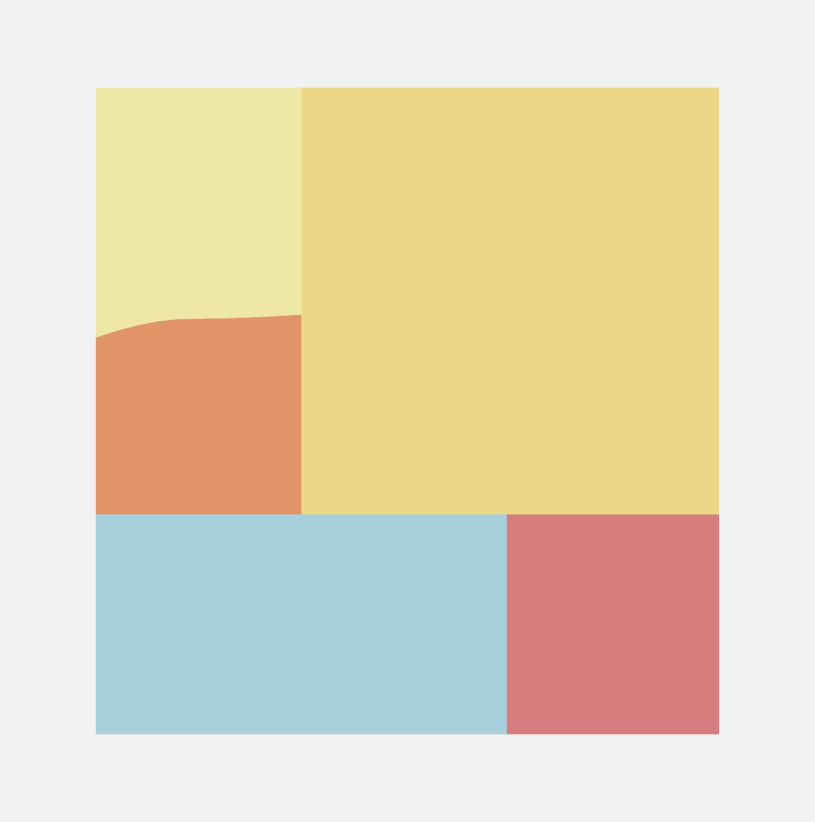
col: Rhythm | den: Chance | gri: Thirds
[More to follow]